I used to think that stats worked like this:

Unfortunately the real world isn’t like that. Instead it’s more like this:
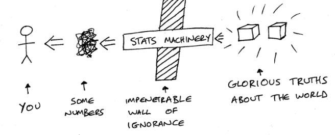
You don’t have direct access to the Glorious Truths because there is the Impenetrable Wall of Ignorance in the way. Your only hope is to punch through the wall with some Stats Machinery. One end of this sits amongst the Glorious Truths to harvest them, and some Numbers get spat out from the other end of the machine for you to see.
The important question is – which of these is true for your set-up:
- Numbers ≠ Glorious Truths
- Numbers ≈ Glorious Truths
- Numbers = Glorious Truths
The answer is: It depends on how careful you are when building and using the Stats Machinery. I’ll go through three examples to illustrate.
Picking up Good Vibrations
Imagine you had a sound that you wanted to record or process in some way, e.g. work out some average value like RMS. To keep it simple, we’ll assume it’s a sine wave with a single frequency like this
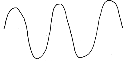
On the screen this is a continuous line, but that is part of the Glorious Truth. A computer (which is the thing you’re building your Stats Machinery with / on) would sample it, i.e. take its value only every so often. Because the problem involves sampling waves, that means you need to take account of Nyquist’s sampling theorem when building your machinery. This means that the frequency with which you take the samples needs to be at least double the highest frequency part of the signal you’re looking at. (The wigglier the line, the closer together you have to put dots on it for it to be a sensible dot-to-dot puzzle.)
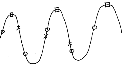
If you sample at twice the wave’s frequency you get the circles or something similar. Note that in one complete wave, e.g. from one peak to the next, there are two circles. If you sample at the wave’s frequency (i.e. less than double the wave’s frequency) then you get something like the squares. If you sample at somewhere in between 1 and 2 times the wave’s frequency you get something like the crosses.
The important thing to remember here is that the circles, squares or crosses are all that you’ll have – these are the Numbers – and the nice smooth and continuous wave is the Glorious Truth, hidden on the other side of the Impenetrable Wall of Ignorance.
You have some Numbers and try to interpret them. It’s as if you’re trying to reconstruct the original wave from the samples, similar to drawing a dot-to-dot puzzle. If you have the squares or crosses, then many possible waves could fit through them
This ambiguity makes the Numbers dangerous and useless. You could come up with an answer based on them, but you could come up with different numbers based on them that would be just as valid (i.e. not very). If your Stats Machinery is built better, sampling at least twice the frequency of the highest frequency component of the wave, then the Numbers are much more tightly constrained in terms of which waves they could represent, and so any analysis built on them is much more sound.
Is it better now or now?
The next example is A/B testing. This is described at length in Martin Goodman’s video on A/B testing, so please refer to that if this is unclear. In this case, the Glorious Truth that you want is: Is version B better than version A? (A and B are two versions, often an old version and a new version, of something like your website. Better depends on the context, but could mean something like: is easier to navigate, leads to more sales etc.) This truth breaks down into two sub-truths:
- How good is version A?
- How good is version B?
Assuming that you’re interested in how much people buy, imagine a situation where the plot of value of orders versus frequency looks like this:
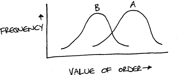
B is worse than A, so you should reject it. Remember, this is the Glorious Truth you want but can’t get to directly. So you run an experiment where some users are shown version A and others are shown version B, and after a while you do a similar plot to the one above and get this: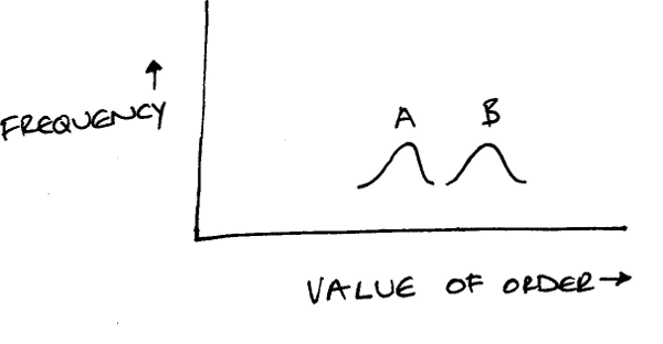
These Numbers are compatible with the Glorious Truth, even though they appear to contradict it. In the Glorious Truth, the right-hand end of B is to the right of the left-hand end of A. This means that some users on version A will spend less than some users on version B. (However, overall, users will spend more on version A than they will on version B.) If you looked at enough users, then eventually you would get the Glorious Truth. If you haven’t got close enough to eventually, you can’t be sure that you haven’t been lucky (or unlucky, depending on how you look at it). The visitors to your site might have been a combination of the low-spending-with-A users and the high-spending-with-B users. These users definitely exist, but they are in the minority compared to the high-spending-with-A users and the low-spending-with-B users.
Here, the care you need to take with your Stats Machinery includes knowing how long it must run before you can rule out good luck or bad luck pushing your Numbers too far away from the Glorious Truth you’re after. For more details on this, I recommend Martin Goodman’s video on A/B testing.
Surveys and Samples
The last example is to do with surveys or other ways of taking a sample of some people from a larger population. For instance, you wanted to know the average salary of people in a series of countries (the Glorious Truths), so you somehow get the salaries of 2,000 people per country and then work out the average salary of each country’s sample (the Numbers that are the closest you can realistically get to the Glorious Truths).
I will ignore the very important questions to do with how you collect this sample, and assume that you just have the information about 2,000 people per country. Unfortunately, in many countries, women are paid less than men. Therefore, if your sample has lots of men, the average of the sample won’t accurately reflect the average of the country as a whole. (Similarly, a sample of just women wouldn’t produce an accurate estimate for the country’s average salary either.) This kind of error – your sample not reflecting the greater population – is known as sample bias.
You can try to improve the accuracy of your estimate (i.e. move your Numbers closer to the Glorious Truths) if you have two more bits of information:
- The gender split for each country, i.e. what percentage are men and what are women (for simplicity, I am assuming that gender is binary);
- The gender of each person in your sample.
If your sample has 500 women and 1,500 men, but the corresponding country is 50/50 male/female, then your sample under-represents women by a factor of 3. Assuming that the 500 women have salaries that generally reflect those of women in the country as a whole, you can just amplify each woman in the sample. I.e. you effectively clone each woman, and so count her three times (with the same salary) rather than once.
This will make the sample appear to have 1,500 women and 1,500 men i.e. 3,000 people in total rather than 2,000. However, averages and percentages don’t care about the size of the population, so that doesn’t matter. You have made the women’s contribution to the sample’s average salary more correct, by making the women’s contribution to the sample more correct. This approach is known as calculating a weighted average. A simple average of the sample would have had too great a contribution from men, and so would tend to be higher than it should be. A weighted average of the sample will address the under-representation of women, and so will tend to bring the average down to be closer to reality.
This approach is not perfect, as it depends on some assumptions that might not be true. As the gender split of the sample heads further away from that of the population, the less reliable it is. At the extreme, a sample that is just men or just women can’t be fixed using this technique as you would have to invent salary values for the missing gender. Also, how many factors do you address? Age, employment status, area within the country etc?
Conclusion
I hope that this has been helpful, if slightly depressing and confusing. Real life means that you probably can’t get your hands on the Glorious Truths you’re after. If you’re careful, the Numbers you can calculate will be a reasonable stand-in for them. If you’re not careful, then they will lie to you and mislead you.
The amazing artwork in this article and use of capital letters have been inspired by Wait Buy Why?
The title comes from the Bible, specifically 1 Corinthians 13:12. The King James Version is For now we see through a glass, darkly; but then face to face: now I know in part; but then shall I know even as also I am known. A more modern version (the New Revised Standard Version) is For now we see in a mirror, dimly, but then we will see face to face. Now I know only in part; then I will know fully, even as I have been fully known.

Something that I’ve learned since I wrote the article, and don’t want to edit the article to add. The two sides of the Impenetrable Wall of Ignorance are a bit like the two worlds or two aspects as described by Kant. The Glorious Truths live in the noumenal world – the world as it really is, that we can’t access, and the Numbers live in the phenomenal world – the world as we’re able to perceive and understand it.
A bit more at e.g. https://peped.org/philosophicalinvestigations/article-kants-two-worlds-of-knowledge/ or https://www.waterstones.com/book/how-the-world-thinks/julian-baggini/9781783782307 (the chapter on Ineffable).
LikeLike