Yes, it’s another amazing piece of artwork, showing my amazing artistic skill and drawing tools. If you missed my previous effort, have a look at a previous post on statistics – although I think that the previous post’s artistic style is influenced by Wait, But Why, and this one is more influenced by xkcd.
I’ve also done other posts on automation, and from the amazing graph above you can no doubt tell I’m quite the rock star when it comes to visualising data.
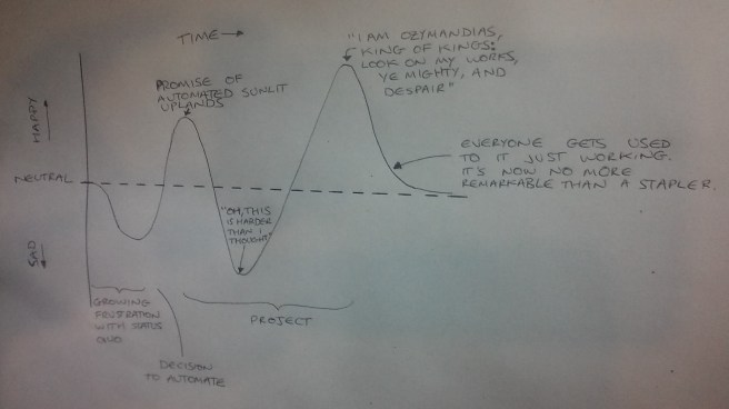
In case the text is hard to read, the labels on the x axis are:
- Growing frustration with status quo;
- Decision to automate;
- Project;
and the labels on the curve are:
- Promise of automated sunlit uplands;
- “Oh, this is harder than I thought”;
- “I am Ozymandias, king of kings: Look on my works, ye mighty, and despair”;
- Everyone gets used to it just working. It’s now no more remarkable than a stapler.
