I live in a place that has a river flowing through it. Like in many places in the UK, we have had floods this week, which has been stressful for people whose homes and businesses have been affected. Fortunately, we were OK and no-one here was affected too badly.
As a complement to the stress and amazing scenes of a world underwater more than usual, I wanted to dig into the relevant data a little. I managed to do so using nice publicly available data from the UK Government Environment Agency, and some free or widely available tools. This is going to be a little coy because I’m not in a hurry to put where I live on the open internet, but I hope still interesting.
Pooling resources?
Because I stare at a computer all day, I sometimes find it easy to ignore the importance of the physical world with rivers and river basins, and mountains etc. The floods have helped me to remember! (When the Eyjafjallajokull volcano erupted in Iceland in 2010, and the ash cloud shut down much of European airspace, I remember Alain de Botton remarking that it was one of those rare events that reminds us that there are mountain ranges in the way of some journeys we might need to take, and so on.)
I live in place A (sorry to speak in code – I hope you get used to it). The river in A comes to us from places B and C (and beyond C too). Sometimes when the river gets high in A, or even floods, the belief is that in order to protect C, water is being allowed to flow away from C as quickly as possible, regardless of how well places downstream (such as A and B) can cope. The implication is that if sluices etc. near C weren’t opened as wide, then the problems in C might be bigger, but the problems in A would be smaller.
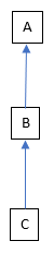
I think that this isn’t just a local issue, but something that happens commonly around rivers. One of the things with rivers is that they connect places in a fixed order, based on physical geography and climate. While we can alter these connections if we really want to, it takes so much effort to do this that, to my knowledge, we tend to stick with how things are. This doesn’t matter how rich or poor the people are in those places, their political, religious, linguistic or other identities and so on. Rivers group people together whether they like it or not, and imposes an order – who is upstream or downstream from whom is fixed.
The belief I mention above and flooding is unfortunately just one example of how people who share a river can fail to share it well. There are all sorts of other potential problems – pollution, taking out too much water for drinking, farming or industry, damming it e.g. for hydro-electric power, over-fishing or otherwise disrupting the natural world downstream and so on.
This reminds me of a case study of Edward de Bono’s Lateral Thinking. To encourage factories that used a river to use it wisely, people thought that it would be good if such a factory were downstream from itself. The point is: if the factory caused pollution, it should suffer from this itself, so that it would be in its own best interests to not pollute.
This is obviously impossible in general, but the convenient thing about a factory is that it will often have separate pipes for water coming from the river and going to the river. These two (a factory being downstream from itself, and two separate pipes) have apparently been turned into law in some parts of the world – the pipe taking water from the river must be downstream of the pipe taking water to the river. So, the factory is effectively downstream from itself.
Getting some data
The Environment Agency publishes an API for its river monitoring data, with nice documentation too – a rare treat. It also puts graphs of this data on its website.
You could access this data in your web browser, because there are no security hoops to jump through for this API. You put the relevant address into your browser, and instead of a web page coming back, you get data in the form of JSON. However, I chose to use PostMan, because it formats the results slightly more nicely. (This isn’t a surprise, as it’s a special-purpose tool for calling APIs rather than a general-purpose HTTP thing like a browser.)
Among other things, the API lets you ask for the data for a particular monitoring station, in descending order, up to the limit it imposes to keep from getting overwhelmed (the most recent 500 readings, I think). You get some meta-data – licence and version info etc, and then the main data. One entry looks something like this, assuming that the monitoring station has the id E12345:
{
       "@id": "http://environment.data.gov.uk/flood-monitoring/data/readings/E12345-level-stage-i-15_min-mASD/2020-12-29T15-30-00Z",
       "dateTime": "2020-12-29T15:30:00Z",
       "measure": "http://environment.data.gov.uk/flood-monitoring/id/measures/E12345-level-stage-i-15_min-mASD",
       "value": 0.433
},
I wanted to get the data into Excel, for a quick way to do charts etc. The easiest way to do this would be to turn the JSON into a CSV file. I could have written some code to do this, but instead I thought it would be quicker to just use a macro in Notepad++. This lets you record key strokes and mouse clicks, then play them back one or more times. I recorded the actions needed to find the next entry, delete everything I didn’t want, leaving just something like this:
"2020-12-29T15:30:00Z", 0.433Some experimentation in Excel showed it was best if I then did a quick search/replace across the whole file to get rid of the speech marks and Z, and turn the T into a space – Excel could then interpret the first column as a date and time correctly.
A downside of using Notepad++ macros rather than code is that there’s no scope for handling errors. Occasionally the data would have a blank where the river level value should be and the macro would go haywire for a bit until it could re-orient itself. I would notice this only by a quick scroll through the file to spot a break in the pattern, and then fix it by hand (by deleting the gobbledygook the macro had left behind when it went haywire).
Graph of river levels
This is a graph of the water levels at A, B and C:

There are a few interesting things here. For each station there is a water level that is considered likely to cause local flooding. Because these are different for the different stations, it took a little thought as to how to show this – what might be flooding amounts of water at one station might be normal for another station. In the end I decided to make the non-flooding bits of each line some shade of grey, and then the flooding parts were a colour. (Details on how I did this are below.)
A and B have two peaks in their graph, but C seems to have only one (there’s a bit of a blip before the peak in C, but I think that’s too small to be considered a peak). There are weird jagged bits in the second peak of B, which is probably due to problems with its water level sensor.
As I have said more than once in my blog, particularly data analysis and visualisation posts, the world is messy and data about it is often messy too. This sensor weirdness is just another kind and source of mess. IOT (the Internet of Things) is a buzzword that can contrast to a less shiny reality such as a machine sitting in a pool of water buried in a hole in the ground, that tries to phone home over a less than perfect communication channel.
IOT can be amazing, but has practical limitations. Has the sensor broken? Is it trying to operate outside the range of conditions it was designed for – too damp, too foggy, too hot, too something else? That’s before you worry about someone trying to deliberately do nasty things to it, either in person (such as stick a screwdriver where one shouldn’t go) or remotely (cracking it or its ecosystem).
There’s something that looks odd at first glance, but I have a theory why it’s that way. The curve for B is generally higher than the curve for C, but the curve for A is generally lower than the curve for B. This suggests that the river is losing water between B and A. I don’t think that this is the case – you have to remember what the number means. It shows how deep the water is at the point of the sensor. It doesn’t take into account how wide the river is at that point, either in terms of its normal channel or the channel it has created for itself by spreading out in a flood. Even without flooding, the same amount of (or even more) water could fit into a shallower river if it is wider by enough. (It’s like rotating a piece of A4 paper from portrait to landscape.)
I realise that I’m not a hydrologist, just someone poking around in some data to see what I can see. For instance, I’m ignoring the fact that water will join the river all along its length, and not just at the start or when rivers join. So, I’m ignoring effects like rain falling harder, or at different times, in some places compared to others. These would all show up in the graphs. Similarly, I’m ignoring human intervention, such as sluice gates being opened at a particular place and a particular time, which would show up in the graphs. Even with these limitations, I hope that this is still interesting and potentially useful.
Excel chart tip
Unfortunately Excel doesn’t let you format a data series (e.g. the values from one station) in more than one way directly, so you have to use a workaround. You separate out your data series into e.g. two, and then format those two series separately in the normal Excel way. The only cleverness you can apply here to make your life easier is to do with separating the data into two series, as shown below.

I put the threshold for deciding which series a point should go into in a cell, and then referred to that cell in a formula. This formula would copy the data value across if it were above the threshold, otherwise give the magic value #N/A. The importance of this is that Excel won’t plot anything in a chart for a cell containing #N/A. This sorted the series for above the threshold, and then I used a corresponding formula for below the threshold. This pair of formula can then be copy/pasted across all values, to give the separated-out data series as I wanted.
More complexity from the real world
I put the graph above up online, and someone kindly explained a source of the missing first peak in the graph for C. Instead of a simple set-up of one river flowing C to A, it’s a bit more complicated than that:

A, B and C are all on River R, as I’ve already described. However, there are two other rivers, S and T, that feed into R. Fortunately there are more monitoring stations, so I can analyse how the different rivers contribute to what I see at A.
To do this, I will look at two sets of three stations: B / D / E and D / F / G. D and E are the last stations on their respective rivers before they join, and B is the first station after they join. Similarly, F and G are the last stations on their respective rivers before they join, and D is the first station after they join. As I got the data for this analysis the day after the day I got the data for the previous one, the graphs are shifted along by a day, but the overall shapes should stay the same.
More graphs
This graph shows the effect of River T on River R – the first river to join R in the diagram above.

As before, each line is split into a below-the-flood-threshold bit (some shade of grey) and an above-the-flood-threshold bit (a colour) – place G is above the flood level for all of the graph. There is one main peak for each of the two upstream stations (F and G), at two different times. There isn’t a separate peak in D that corresponds to the peak in G, but there is a raised-up plateau in D around that time.
The only proper peak in D corresponds with the peak in F – it looks like River T has less impact on the peaks in the flow of River R than the upstream part of R has on downstream parts. It’s interesting that the curve for D has an odd first little peak that’s similar to that in C, even though water has to flow through F to get there and there’s no odd little peak in the graph for F. (The odd first little peak seems to go from C to D, leap-frogging F.)
This graph shows the effect of River S on River R – the second river to join R in the diagram above.

B has the same problem in its second peak in this graph as it does in the first one. E has a problem in its first peak – the top is suspiciously flat. I think that something to do with the sensor has reached its maximum, and so it can’t return any values higher than the chopped-off peak value. (I don’t think that the water depth stayed amazingly constant, just by this station, just for that period of time.)
E has two peaks, but the first is much larger than the first. D has two peaks, but the second is much larger than the first. The two larger peaks in the upstream rivers (D and E) both show up in the graph for the downstream station (B). So it looks like River S has a much bigger effect on R than T had.
If I wanted to spend more time on this, I could have done some analysis that was more numerical and less “this peak looks like that one”. It would probably be along the lines of:
- Establish a baseline or average height for each data series (i.e. how it is normally, when there are no floods).
- Subtract the baseline values from their corresponding data series, to leave just peaks over time.
- See if I could create the pattern of peaks in a downstream series by adding together the peaks in the relevant upstream series. The upstream peaks could be delayed by a fixed amount of time and / or multiplied by a fixed amount – I would play around with the delay and stretch / squash numbers to get things to fit as well as possible.
It would be a bit like Fourier synthesis – trying to add together component data series to make an output data series – but much more manual and hit or miss.
Summing up
While the separate graphs on the EA website were great, I found the combination of a few data series on the same graph to be more useful. It’s easier to compare the series – to see how they line up (or don’t) over time, and see how the depth ranges compare.
There were problems in the data probably caused by sensors, but that didn’t affect things too much. The physical reality was more complicated than I first thought, with tributaries having an effect that I couldn’t ignore.
As I’ve said before, I encourage you to grab some data and have a play with it. If you don’t have access to Excel, something like Google Sheets should do most, if not all, of what you need for this kind of analysis. The other tools I used are free to download, and there are free alternatives if you don’t get on with those. The data was free and didn’t even need me to sign up for an account or jump through complex security hoops to download it. It helped me to understand the world around me in a deeper way.
