I watched a YouTube video about how to play the guitar part for 50 Ways to Leave Your Lover by Paul Simon. It’s an excellent video, that breaks things into manageable chunks that gradually build into the full thing. The video reminded me of diminished chords, and sliding them up and down a guitar, which triggered thoughts that I’ll expand below.
In this article I’ll be rambling about data visualisation – in this case the data is music – and how different visualisations of the same data can answer different questions. I hope it will make sense even if you don’t know much about music (I certainly don’t). If, unlike me, you do know music theory then I apologise in advance for any mistakes. The first three diagrams should be familiar to you (if you play the guitar, at least), but the last two diagrams are likely to be more new to you.
Visualising finger positions
To start with, here is one way of showing some music – specifically, how to play some notes on a guitar. This is a guitar chord chart.

The vertical lines correspond to the strings on a guitar, and the horizontal lines correspond to the frets that lie across the neck of the guitar underneath the strings. The vertical line at the right of the diagram is the highest pitched string, and the line at the left is the lowest pitched string. Normally, when you play the guitar, the lowest pitched string is the one closest to your face and the highest pitched string is the one closest to your feet. That is, the lowest pitched string is the highest in space / on the guitar, and the highest pitched string is the lowest in space / on the guitar (a bit confusing, but you get used to it).
The solid blobs in the diagram show where to fret the strings, i.e. where to push your fingers on the strings so that the strings touch the fret below. This effectively shortens the vibrating part of the string, which changes the note that it plays. Empty circles would show strings that you should play without fretting them, and the Xs show strings you shouldn’t play at all.
It might be a bit confusing if you’re used to the common musical stave, e.g. with a treble clef on it. However, it is a simple diagram that has a close relationship to the thing its representing. It shows you fairly clearly how to use your fingers to produce a given set of notes on the guitar. (Although it isn’t showing how you should use your other hand to pluck, pick or strum the strings to produce the sounds for those notes.)
If you strum the strings on the guitar without fretting any of them, you will get the notes E, A, G, B, D and E (going from the lowest pitched string to the highest pitched). Given that each fret corresponds to a semi-tone, fretting according to the diagram above gives you these notes: F#, C, A, D#. These notes can be described as the chord A diminished or Adim.
Visualising finger positions over time
The diagram above is great for showing you which frets to use for a chord, but it’s less useful if you want to describe a series of chords, e.g. all the chords for a given song. There’s a more condensed version of the diagram above (rotated by 90 degrees anti-clockwise), where the fret to use for a given string isn’t shown by a blob on a given fret, but by a number on the string that says which fret on this string to use. 0 means use the open string and no number means don’t use this string. This is guitar tab:

There’s a less direct relationship to the guitar than in the previous diagram, but now position left-to-right isn’t used to describe which fret. That means this position is free for some other use, and a helpful one is time. This is the diagram of 4 different chords:

The first column of numbers describes chord one, the second column describes chord two etc. This is produced by an excellent online guitar tab tool that lets you generate the numbers from the neck of a simulated guitar and to hear what notes the numbers correspond to.
These four chords happen to be the same basic shape, just slid along the neck of the guitar by three frets each time. There are extra annotations you can add to guitar tab, to indicate things like vibrato, mute etc.
Visualising notes
The previous two diagrams are specific to the instrument used to make the music – the guitar. A more common and more universal diagram to represent music is the stave. It is instrument-agnostic for the most part, other than things like not all instruments can make all possible notes. This diagram shows the same chords as in the previous diagram.

Like in the previous diagram, time is shown by position left to right. Previously, position up and down corresponded to string, and string plus fret number gave pitch of note. In this diagram there is no representation of string or fret at all, but the pitch of note is shown directly by position up and down.
There are many extra things you can add to a stave.
Visualising chords
The four chords I’ve shown in the last two diagrams weren’t chosen at random. Diminished chords of this shape on a guitar have an unusual property. If you slide the basic shape up by three frets, you get the same set of notes again (but not all in the same octave as before, or in the same order). If you can read music better than I can, you will possibly have noticed this from the stave above.
This is based on an odd aspect of musical notes. Pitch is directly linked to frequency of some vibrating thing, e.g. a guitar string. As the frequency goes up, so does the pitch. You can think of there being a ruler that can marks off frequency in some way (e.g. every 1 Hz), and every so often there’s a bigger than normal mark when the frequency has increased enough to get to e.g. C# or F, like rulers that mark every millimetre and then have a bigger mark every centimetre.
However, many cultures also have the concept of octaves. When the frequency of a note has doubled, you have the same note as you started with, but an octave up. I.e. the second note is both the same as the first (it has the same name, e.g. C#) but it’s also different (it’s in a different octave).
It’s as if this frequency ruler were a spiral rather than a straight line. If you imagine the ruler running basically left to right, as you increase frequency you move to the right. However, as you move to the right you also move around the curve of the spiral, which will change your position up and down. By the time you have gone up an octave you have moved 12 semi-tones to the right, but you will have also returned to the same position up and down as you started.
If you imagine this spiral ruler pointing straight at you, with low frequency notes further from you and high frequency notes closer to you, it will look a bit like this:

I’ve drawn it as concentric circles rather than a true spiral because it’s much easier to draw that way.
The lower octaves (starting at 1) are further away / towards the centre of the diagram, and the higher octaves are closer to you / towards the edge of the diagram. The different notes in each octave are the different positions around the corresponding circle. So, if you start at the 12 o’clock position of the innermost circle and go straight up, you start at C1 (C in octave 1), then go through C2, C3, C4 etc. I’ve marked out some, but not all, the notes’ positions across the circles / octaves to make it easier to track where the notes are.
Now we have this kind of diagram, we can use it to represent the four chords from the previous diagrams. To make things clearer, I have shown the notes for a given chord in the same colour. The first chord is in red, then yellow, then green and lastly blue. The numbers in the coloured blobs show which finger on the left hand is used to make that note: 1 = index finger to 4 = little finger. The little finger always plays the highest note in each chord, then the middle finger, then the ring finger and the index finger plays the lowest note. (The fingers are in a zig-zag shape on the frets.) The fingers stay in the same shape but just slide up three frets each time.
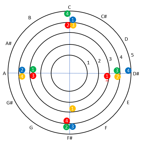
The lowest chord – in red – contains the notes F#4, C4, A3, D#3. You can see that these are a quarter turn or 90 degrees apart from each other. Sliding your hand up the guitar by three frets will increase the pitch of each note played by three semi-tones, which will rotate that note a quarter turn clockwise around this diagram. (When a note crosses through the 12 o’clock position left to right, it jumps out to the next circle as it’s in the next octave. When a note crosses the 12 o’clock position right to left, it jumps in to the next circle as it’s in the previous octave.) For instance, you can start with red 4 and then follow the trail of 4s going around from it clockwise, to see what notes are under your little finger as you slide up to the different chords.
If you ignore which circle the notes are on and look only at their position around the circles, the shape of the first chord has rotational symmetry (of order 4). Each time you rotate the shape by a quarter turn or 90 degrees you will get the same shape. That’s why there’s this relationship between this shape of chord and the effect of going up or down three semi-tones or frets.
This diagram isn’t all that good for showing time (you run out of colours quite quickly) and doesn’t help you as previous diagrams with knowing how to make these notes on a guitar, but it does show the relationships between notes more clearly than the other diagrams.
Well done for reading this far. As a treat, I suggest you watch and listen to this video, made by Stephen Malinowski. It uses an animated version of the concentric circles diagram above, with different coloured lines showing the gap or interval between consecutive notes, although the notes in a different order around the circle (it’s a circle of fifths). Plus it’s a gorgeous piece of music.
Conclusion
There can be many ways to show the same information. Which way you choose can depend on which question you’re trying to answer, and for whom. This includes music too.
