The sound of rain, a breeze through trees, water in a stream and waves on a shore are probably familiar to you. They’re different but similar – they all contain white noise and don’t sound like e.g. a guitar, but they also don’t sound the same. In this article I try to analyse some recordings of these sounds, to see why they sound different but similar.
The sounds
I found some nice samples on Pixabay:
I’m not aware of the equipment used to record the sounds, which means I’m not sure of their quality (although they all sound good to me). Due to the Nyquist sampling theorem, the frequency at which the sound is sampled by the recording equipment sets an upper limit on the frequencies the recording can contain. The highest frequency recorded is half the sampling frequency, so to record a 10 kHz sound you need to sample at 20 kHz.
Also, it’s a case of being as strong as the weakest link. Once one stage in the recording and processing journey has mangled the sound, it’s hard (if not impossible) to get things back again. But, as I said earlier, all the recordings sound good to me.
All the sounds involve a fluid moving in some way – air moving through trees, or water moving along a stream, crashing onto a beach as waves, or falling as rain.
Analysis
I wanted to produce a spectrogram for the sounds (which I’ll explain below). Fortunately, there’s a free online spectrogram tool that lets you upload an MP3 file and it will produce a spectrogram for you. It also has some preset sounds for you to play with. I recommend finding sounds online (e.g. from Pixabay) or recording some (e.g. on your phone) and having a play.
A spectrogram is a way of showing how a sound is made up of different frequencies, and how this mix of frequencies changes over time. It’s trying to show 3 things at once: time, frequency, and intensity (volume). The way this is achieved in 2 dimensions is:
- Time = x axis (time increases to the right)
- Frequency = y axis (frequency increases to the top)
- Intensity = colour
For a given instant in time, you could imagine that there’s a piano keyboard stretched from the bottom of the screen to the top, so you would play it from the right of the screen. The piano keys are the different frequencies, and the colour shows how hard you are pressing each key (assuming you have an unlimited supply of fingers to play as many keys at once as you want).
Breeze through trees
In the recording I used, the breeze was fairly strong and constant. Its spectrogram looks like this:
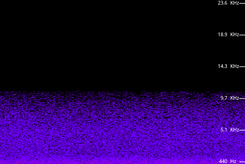
There’s a fairly even spread of frequencies up to about 10 kHz, with slightly more intensity in the 0-1 kHz range. There’s no obvious pattern over time – the intensity just seems to be speckly. I scratched my head to try to work out why the pattern is like this, and I don’t have any clear idea. I guess that the sound is caused by each leaf in the trees being hit and bent, and somehow this produces a small sound. The overall sound is then the sum of these tiny sounds. I don’t know why there’s a peak at the low frequencies.
While I was looking for this kind of sound, I think I found some that had been synthesised. By that I mean someone had generated some white noise and labelled it as wind through trees. The thing that reassured me that this was a genuine recording was when some birds started singing. This is the spectrogram of a later part of the recording (about 1:10):
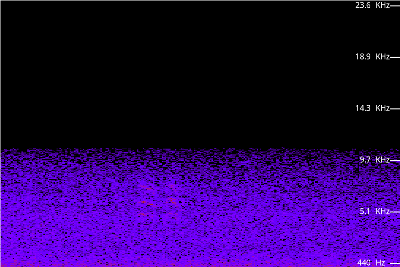
If you look slightly to the left of the middle there are two sets of three red lines, a bit like two sets of scratch marks. (There’s also a bit more intensity generally, which has turned the speckle pattern into a denser one, and made the low frequency strong enough to be shown in red.) This pair of three red lines are the bird cheeping twice.
At this point I think it would be useful to show the spectrogram of some speech as a comparison. This is someone saying “nineteenth century”:

Unfortunately, the colour scale is different, but I hope you can still see the general idea. There is much more variation over time, and also over frequency. This isn’t a surprise as it’s speech, rather than constant white noise. Even though it’s as messy as normal conversational speech often is, what I find interesting is that speech is a mix of three kinds of thing over time:
- Almost silence
- Bird song like parts
- White noise
There are four periods where the top half of the frequency has very little intensity, around the times: 0, 0+2, 0+4 and 0+7. I think these correspond to the four n sounds, where the tongue is against the ridge behind the top front teeth (the alveolar ridge) and blocking off the airway through the mouth a lot. The four n sounds are before and after the first vowel sound, near the end of “teenth” and at the end of “cen”.
There are some vowel sounds, that look a bit like the bird song in that they have lines that are horizontal or diagonal. These lines correspond to peaks in intensity over a narrow range of frequencies, and are called formants. The most interesting vowel sound is the first one, because it’s actually two simpler vowel sounds with a glide from one to the other. (In jargon, it’s a diphthong rather than a monophthong.)
To test this, try saying the vowel in “teenth” but stretching it out over a very long time. You might feel a bit silly, but it’s simple to do. Now try to do the same with the vowel in “nine” – the sound at the start isn’t the same as the sound at the end.
The last section is a messy vowel section corresponding to “ury”.
The white noise sections are the remaining consonants. The “t” at the start of “teenth” is a short and sudden burst of white noise (a jumble of all frequencies) between 0+2 and 0+3 just after the relative quiet of the previous n sound. The white noise centred at 0+5 is interesting because it’s a transition between the two consonant sounds in “th c”. Just after 0+7 is the t in “tury” which is probably pronounced more like “ch”.
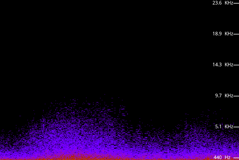
Rain

There are some differences between this sound and the breeze in trees sound:
- Intensity goes up much higher – to about 20 kHz rather than about 10 kHz
- The high intensity at low frequencies (the red bits) goes up much higher
- The general pattern is still speckly, but with some stripiness overlaid
I think that the stripes are caused by individual rain drops sounding more distinct than the sound from many leaves, at least for the rain falling close to the microphone.
Waves
This is speckly too, but the overall volume comes and goes (in waves!). The frequency range is the narrowest so far, and the extra intensity at the low end is more constant than for rain or breeze.
I think that the low frequency is related to sound from the gravel being moved about by the waves. For comparison, here is the spectrogram of someone walking on gravel:
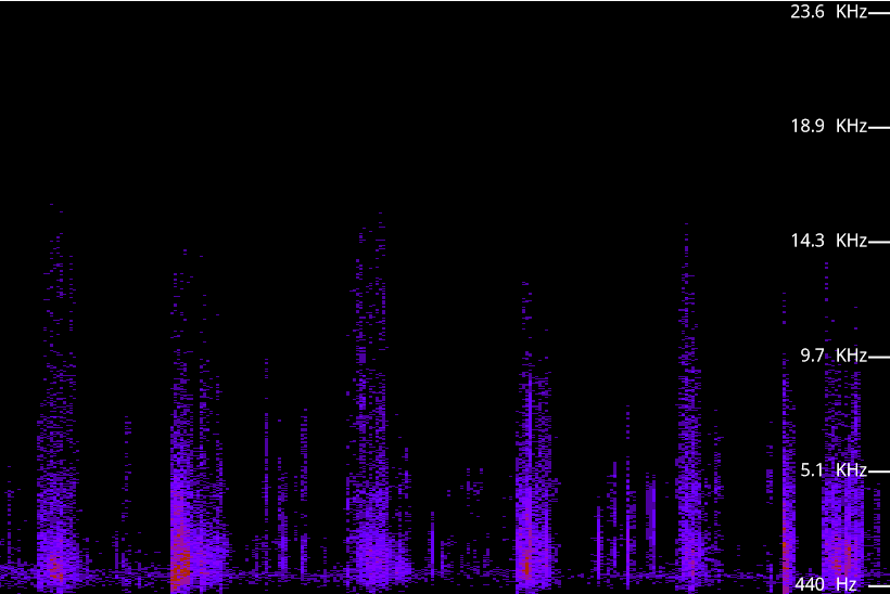
It’s much more staccato than the waves, due to the driver being someone’s foot hitting the ground. However, if you look at the spread of intensity for the non-silent parts it is similar to how it is for the waves.
Stream

This is similar to the others in a few ways:
- It has stripes and large frequency range of rain
- It has the large concentration at low frequencies of waves (actually its concentration is even greater).
Summary
There’s no great point to this – I was just curious and decided to play around with some sounds and tools. If you’re interested in the analysis of bird song I recommend you look at BirdNet which, among other things, is a nice mobile app that displays spectrograms.
Not all white noise is equal, which is great as otherwise we wouldn’t have the variety of rain, waves and breeze sounds. This variation within white noise reminds me of the Sonic Finder. It was a research project about adding sounds to a computer interface to indicate what the cursor was doing, such as entering a new window, leaving one, or moving across a window. I had the pleasure of having it demonstrated to me by its creator, Bill Gaver.
If nothing else, I hope that this has given you a little insight into nature sounds, and some nice tools to explore sounds with.
UPDATE 2022111: The links to the audio files weren’t working, so I changed them to embedded audio player things which I hope let you hear the sounds.
