I recently came across a kind of visualisation called a Bump Chart. This looked oddly familiar to me, and I realised that I knew it as a Bumps Chart (plural). I searched the internet to see if one was the origin of the other, but couldn’t find anything.
I’m not claiming to be the authoritative source on either kind of chart, or whether one’s the inspiration of the other, but I’m suggesting that there’s at least a curious similarity between them, and I’ll let you draw your own conclusions.
What is a Bump Chart?
A Bump Chart is a chart that shows how the relative position of the members of a set varies over time. The set could be rivals for an election, and the chart could show who’s coming out ahead in opinion polls, who’s coming second etc, and how this varies over time as the election draws near.
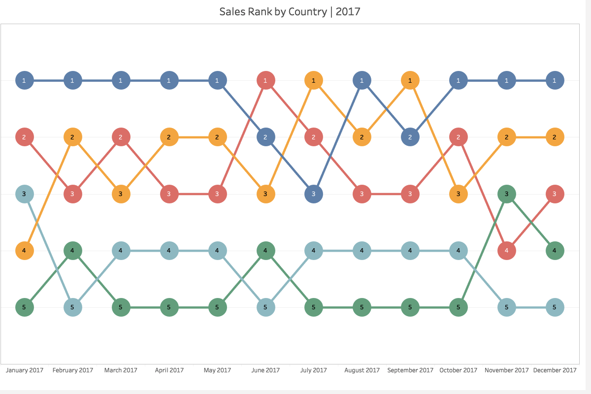
If you go back to the opinion polls example, what a bump chart doesn’t show is things like the size of the most popular person’s lead. It doesn’t show any quantities, just who has the most, who has the second most and so on.
Compared to other kinds of chart you might use, such as line graphs or stacked bar graphs, a bump chart highlights relative rank at the expense of absolute size. Whether this is good or bad is up to you to decide.
What is a Bumps Chart?
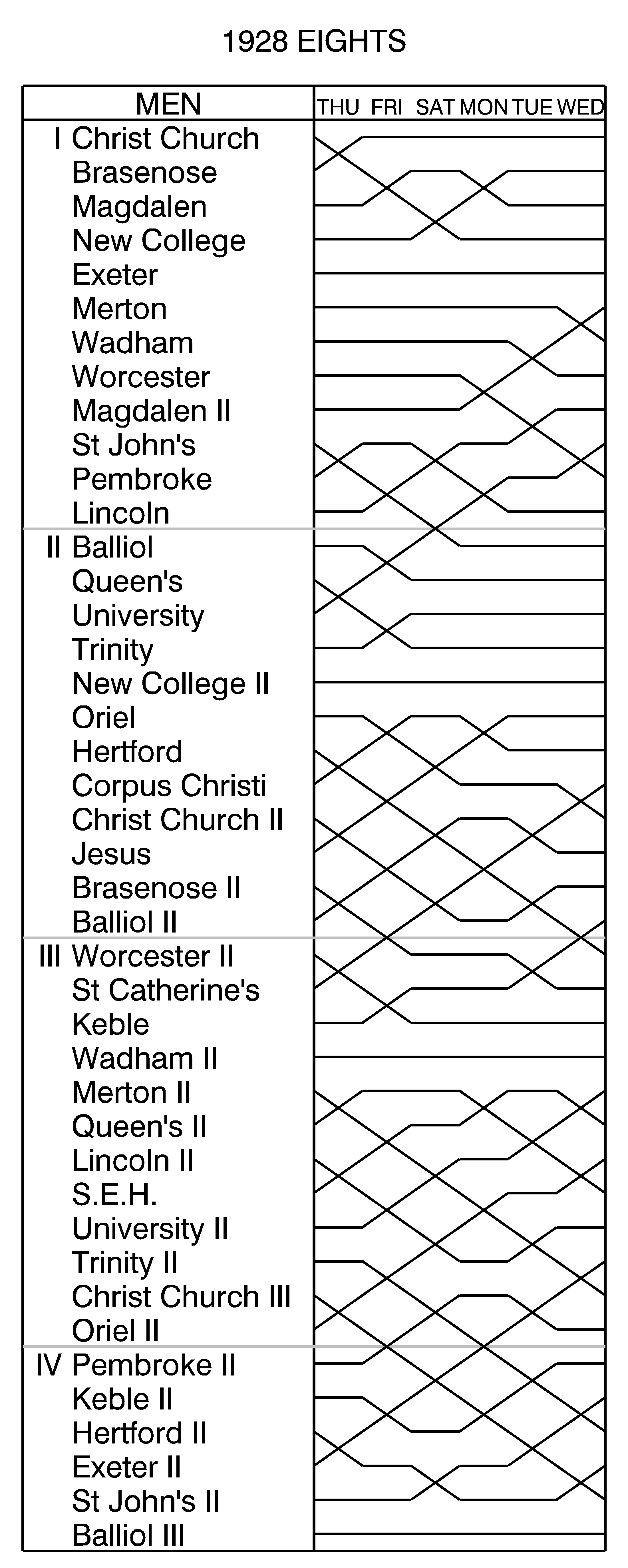
A Bumps Chart is a chart that records the results of The Bumps. In this case, The Bumps is not a hazardous celebration of someone’s birthday that happened when I was in primary school. Instead, it’s a form of rowing race, usually held where the river is too narrow for the boats to compete side-by-side, such as in Oxford and Cambridge in the UK. The first Bumps was held in Oxford in 1815, between two colleges of Oxford University, and Cambridge University had its first Bumps in 1827.
It’s a pursuit race, where the boats start one behind the other along the river, separated by a gap of regulation size, and each boat tries to catch the boat ahead while not being caught by the boat behind. There are several heats (one heat per day, over a few consecutive days), with several divisions’ worth of boats racing per day – one division will have 10-20 boats.

If boat A catches up with boat B, they both withdraw from the race by going over to the bank. A is said to have bumped B, regardless of whether they made contact or not. In the next day’s heat, A and B swap places in the starting order. The lead boat in all but the head divisions is called a sandwich boat, because as well as competing in its division’s race (to give the boat behind it a chance to take its place), it also competes as the last boat in the heat of the next division up (to give it a chance to take the place of the last boat of that division, which would relegate that boat to the lower division).
If boat A bumps boat B, they both withdraw as I previously mentioned. The race as a whole could still have a few minutes to run – there are effectively several small competitions going on at once, so the overall race doesn’t stop when one of those competitions is resolved. The boat behind A now has an extra hard but extra rewarding task ahead of it. In the remaining minutes of the race, it needs to bump the boat ahead of B. This happens relatively rarely, but definitely happens. If the boat behind A bumps the boat ahead of B, they swap over as a second pair – this is called an overbump. That is, if the boats started this heat in the order:
- Y
- B
- A
- X
And A bumps B and then X bumps Y, the boats start the next heat in this order:
- X
- A
- B
- Y
A has climbed 1 place, X has climbed 3 places, B has dropped 1 place and Y has dropped 3 places. There are other, increasingly rare and increasingly big, forms of bump – the double-, triple- and even quadruple-overbump.
More jargon:
- If you neither bump nor are bumped, you have rowed over;
- The boat that ends the last heat as the first boat in the first division is called Head of the River;
- If a boat bumps (or overbumps etc.) in each of its heats it has won its blades – that is, each member of that boat’s crew has won the right to buy an oar (or blade) painted in the crew colours with the members’ names painted on it.
This is an example of a Bumps Chart, from Oxford in 1928
Summary
A Bump Chart or Bumps Chart is a way of showing how a set of things changes in order over time. Like all visualisations, whether it’s the right tool to use depends on the context. They’ve been used in Oxford and Cambridge for a long time to record the results of The Bumps.

One thought on “Bump or bumps charts”