This article is part two in a series:
- How far away is the most remote part of the UK?
- How far away is the closest part of the EU?
- Which bits of the EU are the closest?
The previous article talked about how I produced a kind of choropleth map – instead of the colour on the map showing e.g. average temperature, it showed a number that summarised the map itself. I.e. it showed, for each part of the UK, a colour that represented how far away the most remote part of the UK was from here.
This article extends that. It will show, in a variety of ways, how far away the closest bit of the EU is from the UK. I’ll also go into how I made it a bit, because that’s slightly different from the previous map. I’ll include the previous article’s map to make it easier to compare them. I hope you don’t mind, but I’ve not done any fancy interactive user interface to let you compare them easily – I suggest you put copies of this article in multiple browser tabs or windows to let you flick between the maps or have them side-by-side.
Sorry this is long, but I thought it would be easier to read in one article rather than split into one per map. All distances are in kilometres, partly because the equation I used for calculating distances produces a value in metres.
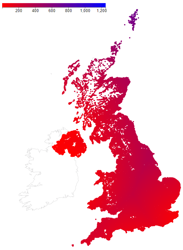
Recap of the previous article’s map
Here is the map from the previous article, although with some differences which I’ll explain below.

The differences between the version here and the previous version:
- I’ve missed out the yellow blobs that show the common most remote places;
- The data for Northern Ireland is better – I got the better data from Doogal;
- Distances are calculated using great circles rather than Pythagoras (see below);
- The colour scale is different.
I want it to be easy to compare the maps in this article, so I’m using the same colour scale for all of them. Unfortunately, this has the disadvantage of squashing the colour range for each map. In the previous article, the scale was 600 – 1250, because the distances in that map were all in that range. They are still in that range here, but other maps have distances that start at 0 (and are in the range 0 – 700). As far as this map’s concerned, the pattern in which colours change across the map is the same as before, but the colour of a given point will have changed.
As before, the map uses one point per UK postcode. This is why there are gaps – in places where the postcode covers a large area, the dots of neighbouring postcodes don’t bump into each other.
Great circle vs. Pythag distances
This is a digression into calculating distances via great circles vs. Pythagoras, which is related to the difference between polar and cartesian co-ordinates. I must confess that before I started work on this article, great circle was something I’d heard but I didn’t know what it meant.
We usually consume maps in 2D – either printed on a flat sheet of paper, or on a flat screen. On something like an OS map, there are regular grid lines showing distance North/South and East/West. These are cartesian co-ordinates (named after their inventor Rene Descartes – who also said “I think, therefore I am”). Each point on the map can be uniquely described by the combination of a distance along the bottom (or top) of the map, and the distance up the side of the map.
To calculate the distance between two points on the map you can imagine that the two points define the ends of the hypotenuse of a right-angled triangle, and then use Pythagoras’ Theorem. This will use the difference in the North/South and East/West positions of the two points.
Unfortunately, the world isn’t flat. Over short distances it’s OK to pretend that it is, but this breaks down as distances get bigger. To cope with the fact that the world is a (slightly squashed) ball, we have to use polar co-ordinates. For this, you have to imagine that the Earth is hollow, and there’s a cannon right at its centre (and this cannon is unaffected by gravity, so the cannonball travels in a straight line). Before each shot, this cannon resets itself to point directly at the location on the Earth’s surface where the Equator and the Prime Meridian (the North/South line that goes through Greenwich) meet.
To get the shot to hit any point on the Earth’s surface you need to:
- Rotate the cannon to its left or right;
- Point the cannon up or down.
Rotating the cannon left or right will mean it aims at somewhere East or West of the Prime Meridian. Lifting the cannon up will mean it hits somewhere in the North hemisphere; pointing it down means it will hit the South hemisphere.
The cannon can hit anywhere on the Earth’s surface. To describe where it will hit, you can say how far you’ve rotated it left or right, and how far you’ve lifted or lowered it. These are measured in terms of angles (usually in degrees, but sometimes in radians). Co-ordinates defined using at least one angle are called polar co-ordinates. In the case of the Earth:
- The cannon’s angle up/down is called latitude i.e. the Equator has 0 latitude;
- The cannon’s angle left/right is called longitude i.e. the Prime Meridian has 0 longitude.
The reason why I could use cartesian co-ordinates (northings and eastings) in the previous article is because I was dealing with just the UK. OS maps project the bit of the Earth’s surface containing the UK onto a flat sheet (they pretend they can squash the ball flat over just a short range). They then take a point off the South West coast as (0, 0) and give distances relative to that. In this article I’m comparing points in the UK with points outside it – France to Denmark. These aren’t covered by OS maps, so I’ve had to fall back to latitude and longitude.
How do you calculate the distance between two points defined by latitude and longitude? This is where great circles come in. If you take a sheet of paper and put two dots on it in random places, as long as the two dots aren’t on top of each other, they will define exactly one straight line that passes through them. (You can make this line as short or long as you like, but you can’t slide or rotate it and have it still passing through both points.)
If you take a ball and put two dots on it in random places, as long as the two dots aren’t exactly opposite each other (e.g. the North and South poles), then those dots define exactly one great circle that passes through them. A great circle is a circle on the surface of a ball, but with a specific property. If you slice the ball open with an enormous axe using the great circle as a guide, the cut will pass through the centre of the ball. If you e.g. took a football and drew around a coin on its surface, that would give you a circle that isn’t a great circle as a cut following the coin’s outline would just graze the surface rather than going through the ball’s centre.
There is an equation for calculating the distance between two points on the surface of a ball, based on the great circle between them. It’s relatively expensive, as it uses trig and square root.
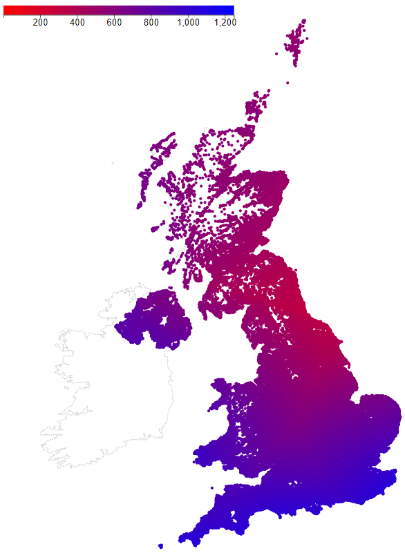
UK to EU mainland
With that out of the way, here is a map showing the distance between each UK postcode and the nearest bit of the EU mainland.

As in the previous article, I put some effort into minimising the amount of work the code had to do (to minimise how long I had to wait for it to run). I started with a map of the world, and then pruned out countries I didn’t want. This includes Norway, which isn’t in the EU. A quick bit of checking on a map showed that I could also remove Sweden, as it’s further away than Denmark for everywhere in the UK. I then removed places away from the coastline nearest the UK, e.g. the Mediterranean coast of France and all its interior.
I thought it would still be expensive to pair up every point in the UK with every point on this coast, particularly given how expensive great circle distances are to compute. For instance, Dover is so obviously closest to the area around Calais that there’s little point doing all the calculations for the area around Cherbourg or e.g. Denmark. So I assumed that I could treat the coastline as a roughly straight line. I put markers along this line at regular intervals to divide it up into sections (like fence posts and fence panels).
For each UK post code region (the first word in the post code) I calculated the distance between one point in that region and each marker on the coast. If there were any markers where the distance was N times bigger than the distance to the shortest marker, I ignored the stretch of coastline around that marker (for that post code region). So, the post code regions in Kent ignored the west of France and Denmark, but the regions in Cornwall ignored everywhere other than west France. I played around with the value of N and the number of markers until I got what I thought was a good balance of speed and small risk of missing the right place.
UK to Eire
I was careful with my use of words in the previous section – I said “EU mainland”. This is because I excluded the Republic of Ireland / Eire. This map shows the distance to the nearest bit of Eire.

I couldn’t use the fence panels / fence posts technique as with the mainland coastline, because the Eire coastline and border with Northern Ireland is too bent. The best I could do was to remove the South West part of the coastline as that would never be the closest to any part of the UK.
UK to EU
This map is kind of the union of the previous two maps. It shows the distance to the closest part of the EU, whether that’s the EU mainland or Eire.
You can see that in England the peak in the distance falls on a line going from roughly the Midlands to the North East. Eire brings the EU closer to Northern Ireland (obviously) and to Wales, South West and North West England, the Scottish mainland and the Hebrides.
Net distances
I’m now coming to the maps that were the motivation for all this. I wanted to see how much of the UK was closer to some part of the EU than it was to some other part of the UK. The first map (from the previous article) supplies the second half of this information – the distance to the most remote part of the UK. The previous map supplies the first half of the information – the distance to the nearest part of the EU.
To show this on one map I calculated what I’m calling the net distance for each point. This is simply the distance to the most remote bit of the UK minus the distance to the nearest bit of the EU. If this number is less than zero for a point in the UK, it means that all of the EU is further away from that point than all of the UK. If it’s greater than zero, it means that some of the EU is closer to that point than some of the UK.
Another way of thinking about it is to imagine two circles that are centred on each point in the UK, one inside the other to form a ring doughnut:
- Circle A that just touches the furthest away part of the UK, which means that all of the UK is inside the circle;
- Circle B that just touches the closest part of the EU.
The net distance is the radius of A minus the radius of B. If A is smaller than B, the net distance is negative. If A is bigger than B, the net distance is positive. The size of the net distance is the thickness of the doughnut – the difference in the radii of the two circles.
I recommend maps.ie if you fancy picking points in the UK (or anywhere else in the world) and drawing circles around those points.
Net distance maps
This map shows the net distance to the EU mainland.

This map shows the net distance to the EU (i.e. to Eire or the mainland, whichever is closer).
You’ll notice that both maps are positive everywhere. I.e. there’s nowhere in the UK where all of the UK is closer than some of the EU.
Summary
Yes, in case you’re wondering, this is about Brexit. I think it’s a bad idea, for several reasons. I realise that this post touches on an unusually controversial subject, so please be warned that I will delete comments that I think are too unpleasant. Note “too unpleasant” doesn’t necessarily mean pro-Brexit or pro-Remain/Re-join – it really does mean too unpleasant.
Another way in which this post’s unusual is that it’s dedicated to two people. To my Dad, who loved maps and Europe, and to Mr D. Eagling – sorry this is late for Founders Day.
