This article is the combination of a few different things. For a long time, I’ve wanted to visualise in some way the details of the plot to the film Ocean’s 11. Also, occasionally I get grumpy about decrees about how people should document their code. Finally, I recently attended a talk given by my friend the author Emily Winslow, about how she writes her novels. As part of this she presented a chart that showed how the elements of the plot feature in different chapters of the book she’s writing. This helped me to see how all these threads could hang together.
So, in this article I’m going to do a few things. First, there will be diagrams that describe two films in different ways, and a pointer to a video that describes a third. Based on a comparison of the films and diagrams, I’ll then move on to some thoughts on using diagrams to describe code.
Ocean’s 11
This diagram is an attempt to describe the plot to Ocean’s 11, drawn using GraphViz. From the first time I saw it, I’ve been struck by how the plot is built very carefully. There’s forward movement, but also cause and effect. Sometimes thing A appears to be included because it causes thing B, but actually that was some sleight of hand and it was there to cause later and more important thing C. In this regard it’s a bit like a magic trick – you get pleasure from being fooled and then the real intention being revealed. In the diagram below there’s misdirection concerning why the team build a replica of the vault – one reason is revealed immediately, but the real reasons are revealed later.
It’s also a bit like a comedian setting up a joke and then delivering the punchline much later. There’s a sense of resolution and completeness when the joke lands, and sometimes the longer the gap between set-up and punchline the more you appreciate the joke. In the diagram below, the longest gap between cause and effect relates to radio-controlled (RC) vehicles.
Time goes from top to bottom. The green indicates when Danny and / or the team accomplish a goal that they had at the start of the film.
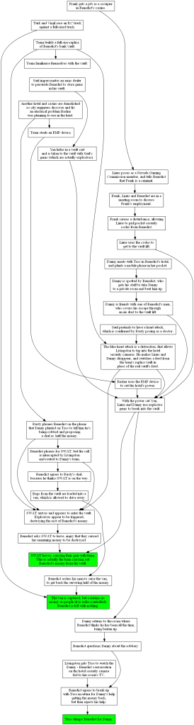
I could have done this exercise for other plot-driven films, such as Knives Out. For instance, the set-up / punchline concerning a mug is really nice. Note that I’ve missed out a lot of the film, particularly parts that establish or develop characters. I’ve also made arbitrary choices about the level of detail, and probably made lots of mistakes.
Love Actually
This diagram describes Love Actually, again drawn using GraphViz. Instead of describing the plot, it describes some of the characters and the relationships between them. When I watched Ocean’s 11, much of my enjoyment came from the careful crafting of the plot. In contrast, in Love Actually the plot wasn’t so strong but instead my enjoyment came from the web of relationships between characters.
As in the previous diagram, I’ve left out quite a lot (including some characters and relationships). Some of the relationships change over time, but only relatively slowly, so I haven’t represented time in any way and just presented things as static. The round blobs are people, and the rectangles are things. I started showing just people, but this got messy in some areas. When I added e.g. the Christmas show, things became much clearer and simpler.

Sicario
In Sicario there’s a scene where the main characters are trying to cross the border between Mexico and the USA. There’s a queue of loads of cars, and elsewhere in the queue are people who might be trying to kill them. It’s a very tense scene, and analysed very well in a video by Cinefix. (They do other excellent analyses of films and TV, comparisons between films and books, and Top 10 style lists.)
While time is crucial here, as in Ocean’s 11, it plays a different role. In Ocean’s 11, you get to see how a complex mechanism operates over time. In Sicario, it’s more like listening to a moving piece of music. The pacing of how intensity varies over time, how different elements are laid out in time to contrast with or develop each other is what’s important. It’s about how our emotional reaction is influenced by the action, the dialogue, the cinematography etc.
Comparing the films and their diagrams
The first diagram could be thought of as answering why? or how? questions – why is what you get when you follow arrows forwards, and how is what you get when you follow them backwards. The second diagram answers who? and how do you know them? questions. The third diagram answers questions like why do I (the viewer) feel this way?
There are many valid questions that aren’t answered by any of the diagrams. In something like a Bourne film you might want diagrams that explain:
- Where things happen
- How Bourne’s memory changes over time
- Which ingenious tool or technique Bourne uses to get what job done (including killing people)
Different properties and questions are important in different films. These are best addressed with different kinds of diagram.
Code
This brings me onto code. As I said earlier, I sometimes get grumpy when people get insistent about documenting code in particular ways, including the diagrams to use for this. For instance, UML includes many different kinds of diagram to convey different kinds of information about code.
Code diagrams are a kind of visualisation. As I said in a previous article, it’s important to think of the user story behind visualisations if you want them to be worth creating or reading. So, you need to answer these meta-questions:
- Who is this for?
- What do they want to know?
- Why do they want to know it?
Much of the time* people don’t want to see e.g. a swimlane diagram. Their real need is to e.g. understand how the elements of a system interact over time. If a swimlane diagram happens to be the best way of conveying this information, then great – use one. If not, use something better.
As with the films, different topics or themes are important to different bits of code. In a distributed system, it will be more important to show where (logically or physically) things are installed, and the communication links between things. In something that implements a communications protocol, a state transition diagram is likely to be important as it shows how the code reacts to different inputs at different times.
So, instead of blindly and dogmatically following a set of rules (or imposing them on others), I suggest that you approach this as a user experience (UX) exercise. Who is the audience, what do they want and what’s the most efficient and effective way of getting them that?
*One exception to this is when there is such a strong expectation by the reader of certain kinds of documentation that deviating from this would be unhelpful, even if the deviant approach would, in isolation, be better. If there are e.g. corporate standards then it’s often best to follow them, because they will mean that the reader is already familiar with what a diagram is trying to say and how it’s trying to say it.
While this might seem to contradict what I said earlier, it’s actually just applying the same approach more comprehensively. What will work best for the user? The answer might be: Follow the standard that they’re expecting.

There is a rather lovely documentation generation utility doxygen, which when I plugged it into a PHP codebase gave me some graphviz diagrams of dependency hierarchies. I thought that was quite nice.
LikeLiked by 1 person