In this article I will do some analysis and visualisation of data on wealth inequality. The data is, slightly randomly, a combination of historical data from three towns in Suffolk from 1522, and the most recent data about Great Britain. I’ll go through the data a little, the analysis, the visualisations, and why I think the visualisations work well for this situation.
Information on wealth distribution in 1522 Suffolk
A friend of mine pointed me at a table of information about wealth distribution for three towns in Suffolk in 1522. This was from the book Age of Plunder by W.G. Hoskins. It looked at the people living in Lavenham, Sudbury and Long Melford, and grouped their wealth into bands: Nil, under £2, £2-4, £5-9, £10-19, £20-39, £40-99, £100-499, £500-999, £1000+.
For each band it gave:
- How many were in the group,
- The total wealth of that group,
- The fraction of the total wealth of the town held by people in that group.
The information was all there, but it wasn’t as clear to me as I’d like. So I thought I’d plot the data as a Lorenz curve, and also calculate the Gini coefficient for the populations. (I’ll explain both below.)
The area was wealthy in the 1520s (and before and after then) due to the wool trade. Lavenham was home to the Spring family, some of the richest non-peers in the country. These days, Lavenham and Long Melford are very pleasant places to visit, in particular Kentwell Hall in Long Melford. Extra information can be found on the Suffolk Record Society’s website, e.g. the Military Survey of 1522 for Babergh Hundred.
Lorenz curve
The Lorenz curve is a way of describing how values of one parameter vary across a population. In the case of this article, the population will be 1522 Lavenham etc, or modern Great Britain. The parameter will be wealth, as in how much you own: money, property, and other physical things like tools, cars etc. There are alternatives to Lorenz curve for at least some circumstances, and below I will describe some and how they compare to the Lorenz curve.
To draw a Lorenz curve, you first sort your data so that you have the smallest value first (e.g. person with least wealth), and biggest value last. You then work your way down the list of data, calculating a running total of the value across all the rows you’ve seen already. This running total will equal the first row’s value to start with, and will end up being the sum across all rows. It’s this running total that you plot as one part of the chart. It will generally start at the bottom left of the page, and then curve up to the top right of the page. It’s the shape of the curve that’s interesting.
The second thing you plot is a straight line that goes diagonally up from bottom left to top right, to touch both ends of the curve, so that it ends up a bit like a bow from archery with its string. This diagonal line isn’t arbitrary – rather, it has its own meaning. If you were to take the sum across the population (e.g. the total wealth), and then divide it equally across every row, then the running total would increase by the same amount per row. This steadily rising total would produce the diagonal line.
The diagonal line helps you to see how the curve deviates from the world in which every member of the population had the same value. The combination of diagonal line and curve help you to understand the meaning of the Gini coefficient (see below), which is a single value that gives an idea of how the curve deviates from the straight line.
I ought to point out that I had information about groups rather than individuals. In order to plot the Lorenz curve, I had to assume that the total wealth for a wealth group was shared equally among the people in the group. This meant that the curves weren’t all that curvy – they’re instead a series of straight lines laid end to end (one per group).
Historic graphs
I’ll show the chart for Lavenham, building it up in stages to show the effect of adding each part. After this I’ll show a chart that shows the curve for all three places. This might be labouring the point a little, but I believe that diagrams and charts work best when they aim at a particular purpose and so are viewed as things that are designed. I want to explain how I designed this, as design involves leaving things out as well as including things, plus deciding what you do with what you include. I.e. it’s a subjective choice, even though it’s all based on objective numbers in this case.
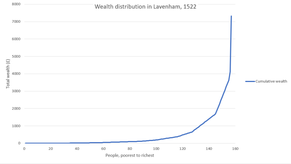
This is just the curve for Lavenham. As you can see, the total wealth is £7,324.
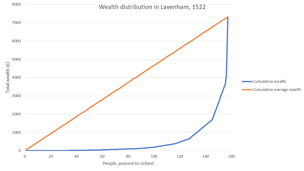
If you add in the diagonal line, it becomes easier to see how the distribution deviates from equality:
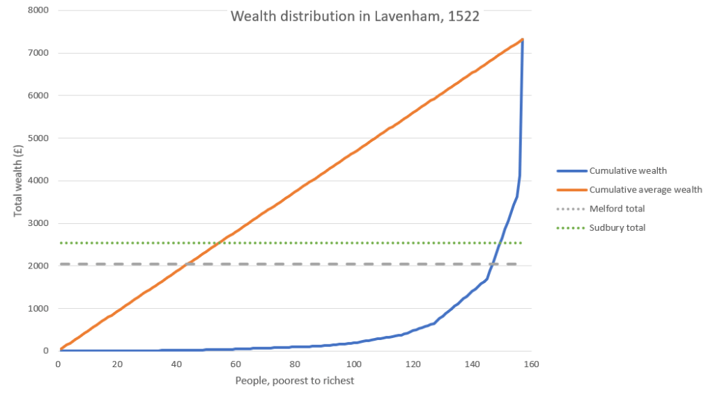
The total wealth of Long Melford and Sudbury are added as horizontal lines. If you look at where these cross the curve for Lavenham, you can see that although the total for Lavenham is nearly four times that of the other two places, it’s only the last 10 or so people in Lavenham who push the total above the total of the other two places.
If you want to show the curves for all places in one chart then you need to do some extra work on the data first. The axes for the charts will want different scales, because the total wealth and total people are different for each place. To overcome this difference, you need to express values as percentage of the relevant total, i.e. normalise the values. Then all curves will fit into axes that are 0-100%.

Adding modern data
I wanted to added modern data to give context for the historical data. As expected, there’s lots of lovely data and charts on modern Great Britain (not UK) in the ONS’ Wealth and Assets Survey. The most recent data is from 2016-2018.
This was also split into bands, but differently to the historical data. It was split into deciles – tenths. Similar to the historical data, this means that the curve is a series of (10) straight lines rather than anything curvier. As with combining the historical data on different places, this data had to be normalised, as both the population size and wealth were radically different from the other data.

Part of the detail that the modern data has that’s lacking from the historical data is the split into different kinds of wealth – net property, net financial, private pension and physical wealth. Financial wealth can be negative, if you’re in debt. This means that the Lorenz curve for financial wealth can dip below 0 (the positive x axis). This graph is taken from Economics Online, and is based slightly older data (2012-2014).

Alternatives to the Lorenz curve
I could have shown this data as a pie chart or as a stacked bar chart. Both of these can be used to show how a whole is divided up into parts. So, in this case I could have shown how the different wealth bands shared the total wealth of a town. However, in this case I don’t think that they would have been as clear because they don’t do as good a job of the other part of a Lorenz curve, which is to show how the distribution compares to a reference distribution. I.e. how far away is the distribution from the case where everyone has the same wealth?
Where a pie chart or stacked bar chart would be better than a Lorenz curve is for cases where there are groups that are based on something other than the parameter in question. For instance, instead of dividing people up by wealth bands, they could be divided up by gender. Also, pie charts and stacked bar charts work where we’re looking at an unordered group, e.g. the ethnic background of students in the intake to a university. In this case there’s no student at the “top” and none at the “bottom” – the students are just at the university or they’re not.
Gini coefficient
The Gini coefficient is related to the Lorenz curve. It gives a number between 0 and 1 (or 0% and 100%) that expresses how much the curve deviates from the diagonal, or how equal the distribution is. A value of 0 means that the curve lies on top of the diagonal and the distribution is completely equal. A value of 1 or 100% means that the curve is flat along the positive x axis and then goes up vertically to meet the diagonal. This is when all e.g. wealth is concentrated in the last individual.
Another way to interpret it is it is the fraction of the area under the diagonal that is also above the curve. When the curve lies on top of the diagonal, there’s no area between them, so the value is 0%. When the curve is a horizontal line and then a vertical line, all the area under the diagonal is above the curve, so the value is 100%. When the curve is less extreme, some of the area below the diagonal will also be below the curve, and some will be below the diagonal but above the curve.
I calculated the Gini coefficient for the historical data using some R I found online. The coefficients are:
| Modern Great Britain | 63% |
| 1522 Sudbury | 75% |
| 1522 Long Melford | 84% |
| 1522 Lavenham | 87% |
Summary
The Lorenz curve and Gini coefficient can be useful ways to show how equal or unequal a distribution is. They are probably better at this than a pie chart or stacked bar chart are, because of the ease of comparing the distribution to a reference distribution (equality). In order to show many distributions on the same chart you will probably have to normalise the data. This is to cope with the distributions having different maximum values on the x and / or y axes.

Another great article Bob,
I went Googling a bit more and found the following you might find interesting labelling world bank data.
https://www.indexmundi.com/facts/indicators/SI.POV.GINI#search-series:~:text=Limitations%20and%20Exceptions%3A%20Gini%20coefficients%20are,of%20people%20in%20absolute%20poverty%20decreases.
They have a nice interactive map, but unsurprisingly I don’t see any links to a lorenz curve plotted for each place. I Guess without the curve, the coefficient alone loses meaning.
LikeLiked by 1 person
Thank you. The map is very nice – thank you for that too. I was a bit puzzled at the numbers to start with, but then I realised that the map shows the Gini coefficient for *income* and not wealth. They will probably be related, but aren’t the same, and they’re both important.
I agree completely with the quote. There are a huge number of questions, some really important, that I haven’t touched on. One of the more abstract ones is the meaning of the coefficent – it’s ratio of the area of two regions, and doesn’t tell you much about the shape of them. You can shuffle the inequality (by shuffling the wealth / income) while keeping the total inequality / area the same. For me, the size at the bottom end is the most important – how many people go to bed hungry, or send their children to bed hungry etc. Also it won’t tell you anything about the total or average wealth of a country, just how the wealth is shared out.
I’ve deliberately not gone into interpretation of the figures, because that’s a can of worms that would take a long time to talk about properly. At the risk of opening it, I want to mention the odd combination of emotions I’ve had when I’ve volunteered at my local food bank (only very occasionally, unfortunately).
On the one hand the people who run it are, in my experience, utterly lovely people who are meeting people’s basic needs with practical kindness. On the other hand, I’m livid that a supposedly wealthy and civilised country like the present-day UK needs them. Not only that, but austerity, Brexit and the pandemic mean that they have been needed more and more over the last 10 years or so: https://www.trusselltrust.org/news-and-blog/latest-stats/end-year-stats/
LikeLike