In this article I’ll try to explain the statistics term regression to the mean. I’ll describe what it is, why it happens, and what consequences there are for important things like developing medicine, training and education.
What is regression to the mean?
Imagine there is a group of students taking a test, where the range of scores is 3-18. If you plotted the number of students with each score, it’s likely that you would get a bell curve as shown below.

The mean or average score is 10.5, which is also the most common score – this is the dashed orange vertical line. As you move away from the mean score (with scores getting smaller or bigger) then the scores get less common. So far, we haven’t encountered regression to the mean – this is fairly normal stuff.
Imagine that we take the bottom 10% of students (those with scores to the left of the grey dashed line) and the top 10% of students (those to the right of the green dashed line) and re-test them using a new but equivalent test. I.e. it’s a test that’s just as hard as the previous one, covering the same areas, but the students aren’t helped in the second test by having taken the first test – they’re independent events.
You might expect that the bottom 10% of students would continue to score poorly, and the top 10% of students would continue to score well. Instead, what happens is that the bottom 10% of students do a bit better in the second test than in the first test, and the top 10% of students do a bit worse. This is regression to the mean. This chart shows the regression – the dashed lines show how the bottom and top 10% were in the first test, and the solid lines show how they are in the second. Both groups have, in general, shifted towards the overall mean.

Why is it happening?
It’s not because people are cheating, or the test is being marked badly or inconsistently. All that’s happening is that we are discovering that some people are less unusual than they first appeared.
You need to keep in mind the fact that there are two different things: on the one hand, there’s some underlying platonic set of glorious truths (about the students and their abilities), and on the other hand there’s the information or numbers we’re able to get (the marks of two tests). We hope that the numbers are related to the truths but we’re not sure how strong this relationship is. (For more on this, please look at my article Stats: Through a glass darkly.)
Let’s look at just the 6 people in the bottom 10% who got a score of 5 on the first test. It’s unlikely that these people will consistently score 5 on every test. It’s more likely that they will have a range of abilities in this area, and sometimes they will have good days and other times bad days. This diagram shows a possible description of the 6 people and their abilities. Each row is a different person, and the shading shows how likely they are to get a particular score. The pale regions show unlikely scores, and the deep green show most likely scores. The results are one brief glimpse of their ability. We are trying to construct the pattern of shading for each person (the glorious truths) but all we have is a single number.
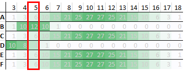
For people A, C, E and F, a score of 5 is them on a bad day. It’s unlikely but possible. For person B, a score of 5 is what they will get most days. For person D, 5 is a good day. All the people tested could, in theory, score 5, but how likely that is will vary from person to person.
What happens in the second test is:
- Person D has another good day
- Everyone else has a normal day
You might be wondering how I came up with the shadings / probabilities for these students. I based them on the bell curve from the overall population. One way to get the bell curve from the overall population is if everyone were like students A, C, E and F. Their probabilities reflect how common each mark is across the population as a whole. I then came up with some tweaks on this pattern for students B and D, mostly to illustrate the point, but while keeping the tweak small enough that I thought it was plausible.
In the extreme example, everyone would look like students A, C, E and F. In this case, while it’s unlikely that a given student will get a score of 5, it’s highly unlikely that no student will get such a low score on a given test. It’s as if there’s a rota that says whose turn it is to get 3, 4, 5 etc. in a given test. There are only a few slots on this rota for a score of 5, and many more slots for 10 and 11. So, across the rotas for many tests, a given student will not often have to fill the slot for 5, but (on average) some students will be there for every test.
Just rolling dice
The extreme example could happen if each student’s test score were completely random. If you throw 3 normal (6-sided) dice and add up the values, you will get a result in the range 3-18 inclusive. If you do this often enough, the frequency of the different scores follows the bell curve. (Players of table top games such as Dungeons and Dragons will recognise this as 3d6.)
The bell curve shape is due to how many possible ways there are to get different scores. To get a 3, each die has to come up 1. As soon as one of the dice is something other than 1, you can’t get 3. To get a 4, there are 3 possible ways (112, 121, 211). So, it’s 3 times as likely that you’ll get a 4 as a 3.
Imagine you get a lot of people to roll 3 dice and tell you the total. You then take the people who rolled 3-6 and the people who rolled 15-18, and ask them to roll again. It’s possible that the people who rolled 3-6 the first time will roll a low score the next time too, but it’s more likely that they will roll something closer to the mean. They haven’t suddenly got better at rolling dice, it’s just regression to the mean. Similarly, the people who rolled 15-18 the first time might do so again, but it’s more likely that they will also roll something closer to the mean. Not because they’ve suddenly got worse, but because of regression to the mean.
The need for humility
There are two things going on here that people need to be grown-up about and recognise how things are rather than how they’d like things to be. The first is, as I mentioned above, the fact that our ability to measure things is imperfect. (We look “through a glass darkly”.) Even with care and effort, we can’t assume we will get an accurate view of things. People like scientists, spending years and millions of pounds on things like the Large Hadron Collider, still qualify their results with error bars and confidence levels.
The other thing is that human performance (including our own) is variable, and we can’t control (and maybe aren’t even aware of) all the sources of variability. Our efforts can help to shift the bell curve of our results one way or the other, and maybe tighten it up so it spreads out sideways less, but we aren’t robots or completely in control of our environment. It’s important to remember that behind test scores and other statistics are real human beings, with all their frailties, idiosyncrasies and unreliability, in situations that they probably can’t completely control.
Consequences
Imagine you are developing a treatment for low blood pressure (you’re trying to increase it). You measure blood pressure in a group of people, pick out those with low blood pressure, give them the treatment, and then measure their blood pressure again. You then compare the two blood pressure readings to see how effective the treatment is.
If there is random variation in the reading, then regression to the mean could happen. This variation could be due to imperfections in the equipment used to measure blood pressure, how it’s used and by whom, day-to-day variations in the patients such as how stressed they are etc. If you pick out people with low blood pressure, give them the treatment, then measure them again and see an improvement, how much of that improvement is because of the treatment and how much would have happened anyway due to regression to the mean?
One solution to this is randomised control trials. You find people with low blood pressure, then randomly divide them into two groups. One of the groups gets the treatment, and one doesn’t (called the control group). Ideally, no-one knows who is in which group, in case simply knowing you’re receiving treatment will make a difference (such as reducing your stress) on top of the difference caused by the treatment itself. This is where things like placebos and double blind protocols come in.
Given the similarity of the control group and treatment group, you hope you can assume that regression to the mean will have the same effect on the results from the second test of the two groups. That means you can take the second test’s results of the control group as a baseline, and compare the treatment group’s second test results to that. (You don’t compare the treatment group’s second test results to their first test results, because of regression to the mean.) More simply put, if the treatment improves things more than just doing nothing does, then the treatment has had an effect. The problem is, you need to take a little care to have an accurate picture of the effects of doing nothing.
This isn’t just a problem in medical research. In education, you might want to give extra support to students who are struggling. Given the limited time that teachers have and the limited money that schools have, which forms of support are the most effective? While there’s much more to student outcomes than test scores, you want to make sure that test scores aren’t misleading, so it’s a good idea to talk to experts in evaluating education impacts.
If you are developing a website that sells things, and you want to increase the amount of money people spend on it, then you also need to worry about regression to the mean. You measure how much money people spend over some period of time, and try to identify people who don’t spend much. You change the website in some way and then measure those people again. Has the amount they spent increased? If so, how much was due to the change, and how much was regression to the mean? That’s why you need to take care with A/B testing.
Baggage from language
Unfortunately this is an area where there are a lot of potentially loaded terms, like good, doing well, bad day etc. On top of that there’s regression in regression to the mean. Often regression has negative connotations, as in regression tests in software trying to catch functional regressions, or taxes being regressive (like V.A.T.) rather than proportional or progressive (like income tax).
The least loaded way I can think of for rephrasing regression to the mean is something like discovering that some people are less unusual than they first appeared. While a particularly low or high value is possible, it’s unlikely or unusual. It’s like there’s an elastic band attaching an individual to the mean, and the further they move away from the mean the less likely they are to hang around there.
Summary
Regression to the mean is a simple but important concept that highlights the difference between unknown properties (such as students’ abilities) and our attempts to measure them (via e.g. tests). We can sometimes factor out the effects of regression to the mean by things such as controlled trials. It also highlights the danger in reading too much into isolated statistics, particularly if we are attaching importance to those statistics.
This article was inspired a Veritasium video about getting fooled by statistics, which was in turn inspired by the book Thinking Fast and Slow.
