A friend asked a question to do with Coronavirus that I couldn’t answer but I thought I should. So I got some data, did some calculations on it, and then worked out how to display it. The question was: how bad were hospitalisations and deaths from Coronavirus (in the UK) when the daily reported Coronavirus cases were as bad as they are now?
This is in the context of the current rise in Coronavirus cases, largely due to the spread of the delta variant. As before, I got data from the official UK Coronavirus website.
If you want to just see some hopefully useful graphs, and don’t care how I made them:
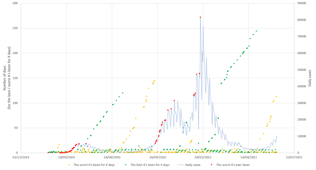
- Click on the image below of three graphs above each other, which will take you to a bigger version of those graphs.
- Hover over or tap on a point on any of the graphs. It will be highlighted, along with the most recent point that was as bad / good as the point you’re over.
- The other two graphs will highlight their points for the same two dates.
I’ve done a few other things on or related to Coronavirus:
- Random numbers to protect privacy
- Coronavirus, risk and software testing
- Sankey diagrams to explain Coronavirus and Covid19
26th June 2021: Updated the data (click through to see the updates).
Crunching the data
This is one of the many areas of working with data where the devil is in the details. (Life is messy and complicated, so data about it is often messy and complicated too.) Looking back to when the data was most recently like it is now has two cases. One is when today is on the right-hand side of a hill in the graph, and you want to find the corresponding point on the left-hand side of the hill, and the other is when today is on the right-hand side of a valley, and you want to find the corresponding point on the left-hand side of the valley.
In an ideal world, you would start at today and then work back in time until you found a point on the other side of the valley or hill that had the same value as today. However, it’s unlikely that you will find an identical value. Instead, you will have to find the first day that has passed today’s value. The graphs below try to explain this.
If you are currently thinking about 6th May 2021, and it’s on the right-hand side of a valley, the first day that’s at least as bad as today is 2nd May 2021 (60 finds 68 and ignores 48). If 6th May 2021 is on the right-hand side of a hill, the first day that’s at least as good as today is 2nd May 2021 (40 finds 32 and ignores 52).
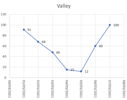
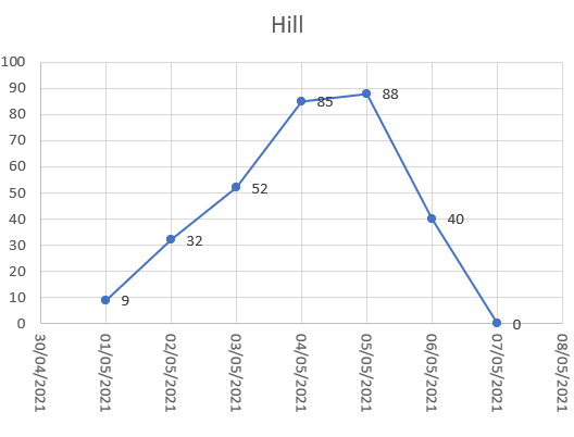
If you’re on the right-hand side of a hill, you need to find the first day that has today’s value or less. If you’re on the right-hand side of a valley, you need to find the first day that has today’s value or more.
In more maths-y terms: a valley is where the slope or first derivative of the graph goes from negative (downhill) to positive (uphill). A change in the first derivative from negative to positive means that the second derivative is positive (the first derivative is increasing). Similarly, a hill is where the slope or first derivative of the graph goes from positive to negative. A change in the first derivative from positive to negative means that the second derivative is negative (the first derivative is decreasing).
We now have a more robust way of finding an earlier day that goes with today, however it raises another problem: how do you know if you’re on a hill or in a valley? There’s no robust and non-arbitrary way of defining this, particularly given how wiggly the data is in real life.
The way I’ve arbitrarily chosen to define this (which has flaws, but is I hope good enough):
- Calculate the average over the last 7 days before today.
- If today’s value is less than the average, you’re on the right-hand side of a hill, otherwise you’re on the right-hand side of a valley.
I could have done several different things, such as picking a different number of days, or applying weights so that days make less difference to the average as you go back in time, or some approximation of the second derivative of the graph, but I felt this was good enough. It’s important to note that I’ve not changed the data plotted in the graphs, i.e. what shape the lines are. All I’m doing here is picking which point to highlight when you hover over another point.
I briefly thought about calculating this in Excel, but the finding a value arbitrarily far in the past for each point was beyond my Excel skills. So I wrote a small program in C# to read the CSV files I downloaded, calculate everything, and write out new CSV files.
Displaying the data
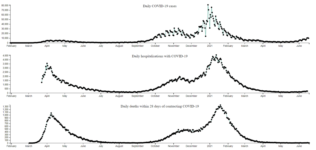
I first did a quick graph in Excel, to get a feel for the data and how I should display it. This is just daily cases data, showing both the cases themselves and how many days ago the matching point was from today. The different colours for the days-ago graph are for when the graph is improving (green) or getting worse (yellow). Red marked the worst days so far.
This is just one data series (I wanted to add in hospitalisations and deaths) but it was already unclear. So, I realised I ought to put more effort into displaying the data, which for me means using D3.
I realised that it would be unclear if I put all three data series on one graph. The cases get to close to 80,000 at their peak, but deaths doesn’t rise above 1,200. Also the graphs are very similar but not identical, so even if I plotted the graphs using two different vertical axes (which would stop them from being squashed vertically), they would be a bit jumbled together.
So, I needed to plot the data series on different graphs, but wanted it to be easy to compare them. That meant that they needed to line up underneath each other, which meant that they had to be over the same date range. In practice this means that the hospitalisations and deaths graphs need to use the cases date range.
I’ve sized things so that the graphs just fit on my laptop screen, which probably doesn’t work on a phone and looks odd on a desktop. Below is a static version of the graphs. Please click on it for an interactive version that lets you hover over points to see the relationship between the present and past, across the graphs.
What stands out from the graphs
The first is that the data is wiggly, which can make it difficult to pick out the point you want. It’s interesting to note that the official UK government Coronavirus website shows the raw data and also the seven day average data, which shows the same fundamental trends but is less wiggly.
Beyond that there are a few big picture things I notice:
- In April / May 2020 there was a relatively small peak in cases, but a much larger peak in hospitalisations and deaths. The peaks in hospitalisations and deaths around January 2021 have a much larger corresponding peak in cases.
- Beyond this first peak in hospitalisations and deaths, there is a lag between a rise or peak in cases and a corresponding rise or peak in hospitalisations and deaths. (Try selecting the peak in the cases graph, and then looking at the other graphs.)
- Cases have started increasing again since May 2021. This has led to a smaller rise in hospitalisations and an even smaller rise in deaths.
As in my previous things about Coronavirus data, this is only a very crude view of things. It ignores long Covid, effects on mental health or non-Covid physical health conditions, people struggling financially or losing their jobs and many other very important things. It’s also only about the UK.
I’m no epidemiologist, virologist, immunologist, or any of the other relevant kinds of expert. So, I hope you continue to follow the recommendations of those experts for where you live.
26th June 2021: Updated the data (click through to see the updates).
