If you have a website, it’s probably to fulfil some purpose – to let people buy something, or look something up etc. This purpose can be articulated as a series of requirements (functional or cross-functional), which can be ticked off during testing.
In this article I will use some buildings to illustrate a point about two extra purposes – reassurance and welcome – that I think need to be addressed first. They will help to stop visitors going elsewhere before they spend much time on your site. You could think of them as the 0th step in usability.
A tale of two buildings
Selwyn College and Newnham College are both colleges in the University of Cambridge. They are next door neighbours too – they sit on opposite sides of Sidgwick Avenue.
This is the front entrance to Selwyn College:

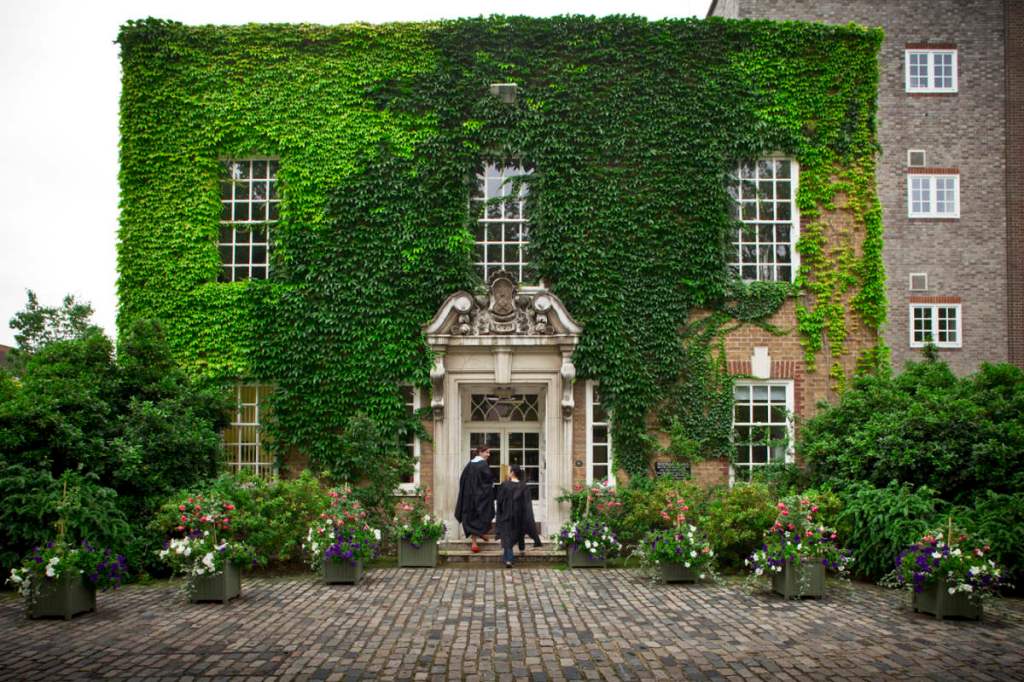
This is the front entrance to Newnham College:

(Both look nicer when it’s sunny and a better photographer than me is taking the pictures.)
Aesthetics aside, I think that the Selwyn College entrance does a better job of being an entrance than the Newnham College one. That might seem like an odd statement to make, but I believe that strangers trying to get to the colleges will have two questions at the top of their mind when they arrive:
- Am I at the right place?
- How do I get in?
When you get to the Selwyn College entrance, I believe it fits your expectations of a Cambridge college, so a stranger is likely to have a decent chance of thinking that they’re outside a college. Then they look for the way in, and a large (closed) door is reasonably clear and there aren’t any other options that could distract.
Compare that to the Newnham College entrance. It’s a nice building, but it neither looks like most Cambridge colleges, nor the other buildings in Newnham College (many of which are gorgeous). To me, it looks most like an office. So you’re stood outside wondering if you’re in the right place, and maybe check on your phone to quell the slight doubt you have.
OK, so how do I get in? The answer is not any of the openings on the ground floor that face the road – they’re all windows. The real answer is the door in the small extension, behind the tree in the middle of the photo, with a white frame. It’s set side-on to the road. I think it’s not obvious, and easy to miss.
Also, compare the new entrance to Newnham College to the old entrance it replaced:
Or to the side entrance to the college, which is still there:

They are both better entrances to my mind – they both look more like college buildings than office buildings, and the way in is obvious. I really liked the old front entrance because the friendliness of the building was an accurate reflection of the friendliness of the staff (in my experience). The new entrance doesn’t convey that – another job that it doesn’t do.
Your website
Visitors to your site probably have alternatives they could go to instead. But they’re currently at your site. Put yourself into their shoes, coming to an unfamiliar site (because, unlike to you, the site is unfamiliar to them). It’s highly unlikely that a visitor will immediately move the mouse to the correct bit of the screen, to type or click on just the thing they need to interact with.
What’s more likely is they will have two needs:
- Reassurance: Am I at the right (kind of) place?
- Welcome: How do I do the thing I want to do?
If your law firm’s website looks more like a website you’d expect from a speedway circuit, maybe the visitor will go back to their web search and try the next alternative. If it looks like all kinds of thing at once, do any of those things come across strongly enough to make a reassuring impression on the visitor?
Assuming that the visitor is reassured that they’re at the right (kind of) place, how do they get in? Can they accomplish the task that’s the reason why they’re visiting in the first place? Is it obvious how they at least start? Do you know what tasks your users are trying to achieve? Do you know the language they’d use when describing those tasks (which might be different language to the language used to e.g. label your organisation chart)? If not, how do you make the relevant front door obvious?
Other requirements
As in buildings, there are important requirements other than reassurance and welcome, that will also have a bearing on the design.
A building will need to contain the right number of rooms of the right type (for a college, that would be things like accommodation, a library, a canteen, meeting rooms, social rooms etc.). It will need to be heated and cooled, lit, ventilated and so on. It should be energy efficient and accessible. A new building has to be integrated into any existing buildings in all kinds of ways – connecting into the power, security, plumbing, corridors and paths etc.
A problem with the old entrance to Newnham College was the steps, which were less accessible than the level way into the new entrance. The new entrance building has much more space than the old one. I’m glad that these aspects are better now than how things were before, but it’s a pity that it fails at the specific jobs that an entrance must do (as opposed to any other bit of the college).
I realise that there are similar competing concerns for a website, but it’s easy for those concerns (and the people behind them) to make so much noise that they drown out the needs of the new visitor. Who in your organisation speaks up for them?
Some jargon
I’ve deliberately been using the term entrance or front entrance in this article. A Cambridge University insider might use the jargon plodge. Plodge, or the more grammatically correct version: p’lodge is short for Porters’ Lodge. Porters are college staff who greet visitors, help students who’ve locked themselves out of their room, deal with incoming post and security and are generally the backbone of the college. The lodge is their office, which is next to the front entrance to the college, and so gives its name to the whole entrance.
Summary
It’s hard to put yourself in the shoes of someone coming to your website for the first time, but it’s important to do so. Think back to the first time you went to someone else’s site, or to a building in real life. Think how you felt, how you were reassured that you were in the right place, and how much welcome you received. Then turn to your site and see if it reassures and welcomes.
